Andre Jute wonders whether a vintage watercolour paper remade is worth the efford.

There is generally less of a problem today about discovering a great deal of information about and opinion on art materials before you buy than there used to be before the advent of the internet. We’ll leave the uninformed, often useless, quality of much opinion for another discussion. Also Helpful is the wide availability of samples you can try before you buy. Some are free, but I don’t mind paying for a sample set off paper or paints. And, of course, all of us are more likely to buy a product without testing if it comes from a maker or supplier of whom we have long satisfactory experience.
Those are my excuses for what happened with the Millford paper. I read the opinions on the net, or had them retailed to me by other artists, and dismissed most of them. Two of the four brands of paper I rate most highly, Saunders Waterford and Bockingford, come from the makers of Millford, the famous British St Cuthberts Mill. I ordered a sample of the Millford from Jackson’s. Then I ordered a pack of imperial sheets of Millford.
The only step I neglected to perform was actually testing the paper before I ordered it. Oops!
A VINTAGE PAPER REBORN
We can let St Cuthberts Mill, via my arts supplies pushers, Jackson’s in London, describe the genesis of Millford:
“Millford is the newset watercolour paper developed by St Cuthberts Mill. It is styled on the discontinued Whatman watercolour paper, after artists grieved the lss of this unique type of watercolour paper.
It is mould made from 100% cotton ( just like the original Whatman), and it’s beautiful surface is created using natural woollen felts. It is deliberately created to have a high resistance to water, so it’s washes perform very differently to traditional watercolour papers. “
It’s a painfully fair description, including some serious flags I should have paid attention to.
A PARTICULAR TEST
In storing the paper, I came across my sample page. It was blank. Rather than cut a pristine imperial sheet, I used the Millford sample for a few tests. If I weren’t such a cheerful survivor, those tests would have thrown me into the well of despond. You have been warned.
READY TO ROCK
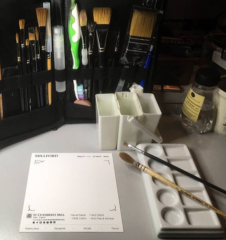
This is the test setup for the Millford sample.

The round brush is a Da Vinci Artissimo sable quill, Series 428 size 2, which in German quill brushes is about the same as size 12. The flat size 2 scrubber is a stiff synthetic brush bought in a set at a supermarket.
PREVIEW OF FINDINGS ON MILLFORD
Millford is, not to put too fine a point on it, a very hard-sized paper. It sips water and pigment so parsimoniously, it would be the ideal paper to take into a desert where you want to conserve you water to slake your own thirst.

As a consequence of the bloody paper behaving unlike any watercolour paper I’ve ever met, including some from India that were supposed to be hard-sized, but were pikers compared to Millford, I lost patience.
At this point, I sucked up in a pipette 3ml of the M. Graham Ultramarine I was using, and dropped it on the Millford, putting my watch beside it to see how long it would resist the liquid. You can see the thickness of the water-jewel by the distorted reflection in it of the ring of the LEDs arround my perfectly circular magnifying deks lamp.

When after adequate time nothing happened, I tilted the paper to get some water flow and pigment spread started.

Immediately after tilting the paper, I blotted both the remainder of the water jewel and the run, and saw the first pleasing effect of this paper, the amount being proportionate to the time the water lay on the surface and that consequently the pigment had time to settle out.
TESTS AND CONCLUSIONS
Now we can get down to brass tacks.

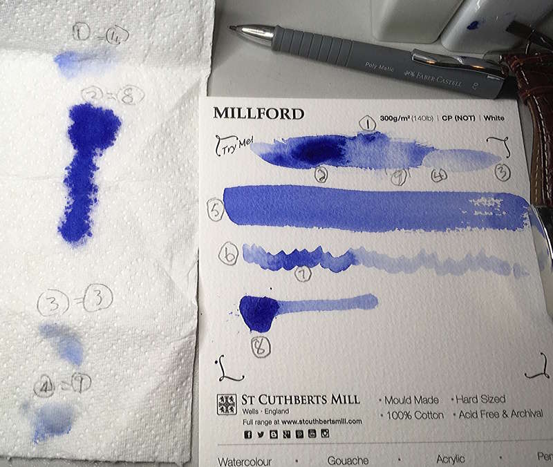
You might want to download the image in HR above onto your desktop as we shall be referring to the numbers on it.
First i painted a swath of clean water across the sample page and then dropped some lightly diluted ultramarine into it at 1. Nothing happened. The wet in wet diffusion you see was chased by the brush.
Next on the ( wrong) suspicion that the paper had already sucked up my water, I added more water to the left side of the bar at 2 and added a good dollop of colour. You can see at the edges of the colour that the pigment moved only fractionally. This paper just doesn’t behave like a watercolour paper is supposed to behave.
I also added more water at the right hand side at 3. This water, on any of thirty or so paper I have, would have sunk into the paper below. Instead, at the end of the test, i it still sat there flexing its surface tension at me.
Aritsts who paint on sheets flat on the table my just get away with using Millford if they are patient about waiting for glazes to dry, but why bother when there are other papers easier to work with?
Painters who tilt the paper support as much as a few degrees, never mind working vertically, will have to pretend back runs from hell were part of the planning for the image. ( I have already worked out but not tried a way to use my five sheets. I’ll tell you some other time if it works for me.)
GOOD LIFTING FOR THE ERROR PRONE
Still on the same master photo, at 4 you can see a wet lift, just one quick press of a double layer of kitchen paper. On the kitchen roll at the left, at 1=4, you can see how much pigment was lifted – more than was left. Further wetting and blotting cycles would very likely lift more. I use a good deal of blotting but have no interest in lifting paint, blotting merely for variation and control, so I didn’t take this test any further.
At 9 is a dry lift after two strokes with a wet brush over dry watercolour. Not as impressive as the wet lift but the Millford fibre seems pretty immune to working, so I think most of the colour could be lifted with further stages of wetting and blotting without risking rubbing the paper visibly raw. The amount lifted can be gauged on kitchen roll at the left at 4=9.
I also had to blot the water I added at 3 before I could move on. The result is at 3=3.
Finally, at 8, you can see that, after considerable time for pigment to sink out of the watercolour, it sits very brightly on the paper even though, as you can see at 2=8 on the blotting record, there was still plenty of liquid and pigment left in it when I blotted the pipette-made water jewel and the run it made when I tilted the paper. The long tail of the blot on the blotting paper being the same colour as ghost on the jewel, while on the Millford the tail is much paler, demosntrated the difference in time that the water lay on the Millford. This is possible control factor.
Notice how the blotted paint dispersed in the kitchen roll, proving that there was nothing wrong with the paint or its dillution.
SOME NEAR-NORMAL OPERATIONS
The flat wash at 5 was applied with the Artissimo in a drish condition. If this were the only test, we’d conclude tha tthe Millford is a wuality paper with a pleasing surface textue that’s very economical with quality pigment. I also like the way the paper’s hard sizing in conjuction with its felt pattern enhances, even enchants, the pigment’s natural tendency to granulate. Thos who for some reason inconceivable to me absoluterly must have this paper and are therefore forced to come to terms with it, would after mastering it be able to achieve a great many effects from the brutal to the delicate.
At 6 I tried out that theory by laying on a light tint on the scrubber. Even a cheap, stiffbrush can control a light ting well the Millford. Note the greater paint load that I applied to the brush higher up. For those who want to handle watercolour like oil paint, going only where consciously directed, Millford could be a dream paper, expecially when the lifting capabilities are considered. For those of us who like the unpredictability of watercolour, its serendipitous effects, and the easy delicacy of watercolour enabled by the best papers, not so much.
WHAT ALTERNATIVE USE IS THERE FOR MILLFORD
Nobody likes to throw out expensive fine art paper. But Millford isn’t any good for binding into a book for a sketcher painting en plein air either. The water and pigment will sit on top of the page and run everywhere when the book is moved, ruining the sketch, and soon, invitably, the book.
Sketchers and studio artists who like dry- brushing may get along better with Millford.
Which leads us to another possibility. Millford could perhaps be pasted to as stiff surface and used as a support for egg tempera or tempera grassa, which are both dry brushing ater soluble media, in the hope that the way in which it keeps all the pigment on its surface willl enhance the already bright results of the tempera. I didn’t try this because, frankly, it is too much bother to set up an egg tempera or even a tempera grassa experiment for the twenty- odd euro I have invested in this paper. I’ll just not buy it again.
Millford is a good sturdy paper, hard to tear and therefore presumably hard-wearing, so yet another possibility is to use it for covering sketchbooks.
In Part 2 of our review of Millford, we’ll investigate by far the most promising and exciting alternative use for Millford, wet and dry multimedia and draw our overall conclussions.
 Andre Jute is a painter and a writer. His most recent book on aesthetics is GRIDS the structure of graphic design ( Rotovision, Switzerland). More about Andre at
https://coolmainpress.com/andrejute.html
Text and photographs copyright ©2020 Andre Jute
