Kuretake Gansai Tambi watercolours have become quite popular among watercolourists and crafters so I was very curious to check myself what is going on with these watercolour sets.

Kuretake Gansai Tambi are Japanese watercolours. Kuretake and other reviewers claim that they are something between watercolour and gouache due to the binders that are used, in other word some kind of semi opaque watercolours.
So after some thought I decided to purchase the 12 watercolours box because it contains a classical range of colours that I think that suits better to my painting and sketching style.
The 12 colours box contains 2 yellows ( cool and warm) two green ( same cool and warm) two blues, two reds, one earthy brown, one cool violet bias red, a black and a white colours. ( click on the image below)
 The colours come in a nice flat carton box covered with with a transparent flat plastic lid. ( I’ll tell you more about what is or can be the use of this plastic lid).

The colour pans are huge comparing with the regular half and full pans. At the photos below you can get an idea about their size.
 Compared with a regular W&N half pan

And here compared with a Jackson’s full pan that is a bit larger than the regular full pans that you can find in watercolour sets.
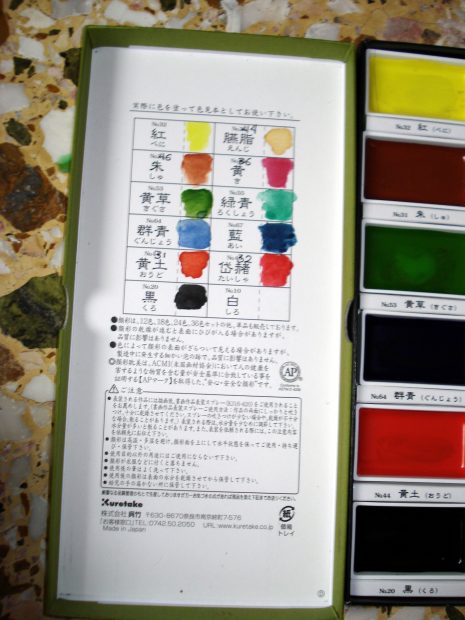 The colours in the pans don’t have names neither indicate what sort of colour is supposed each of them to be, but are indicated by numbers. The underside of the carton box’s lid has a little swatch table in order make there your own swatches. I re arranged the colours in the box the way I find more convenient for me and made the swatch on the carton lid.
Below you can see a larger swatch made on a Strathmore 500 190gsm Mixed Media paper

Contrary to what other reviewers have said, I wouldn’t say that these colours are semi opaque. As you can see ( click on the image to see it larger) most of them don’t cover the black lines that I made with black permanent India ink except the black that is totally opaque, ( but this was rather expected).
The colours are brilliant, can be wetted easily and have a creamy consistency. All these when you use them in their pure form.
But they have a serious in my opinion flaw when they are mixed. Though they give nice and expected colour results when they get mixed, the mixes dry three to four tones lighter in shade from what you see when they are still wet and give very dull colour results.
This makes very difficult to control the values of the work, while the final results lack the brilliancy and saturation that someone would expect from such brilliant and heavily saturated colour swatches as those at the photo above.
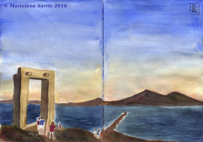
The sketch that follows ( that I made it specifically for this review) needed one trillion colour layers in order to look the way you see it. In consequence looks overworked and quite muddy.
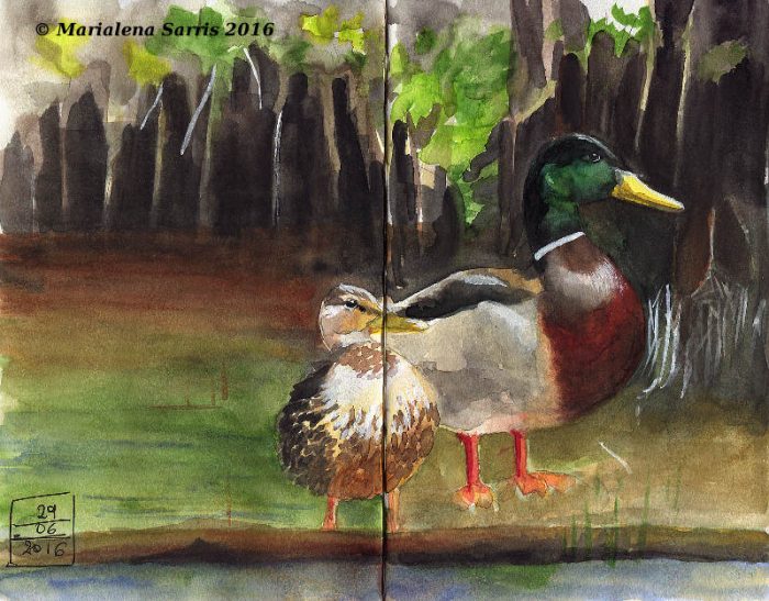
Same with the sketch below. Less layers this time ( I didn’t bother that much ) and again all the mixes I did were weak in colour and dried quite dull and three to four tones lighter than I expected. Adding some more layers to boost the colour saturation gave me muddy and blurry results as well.
Quite disappointing results from such otherwise brilliant and heavily saturated at a first glance colours.
Take also in mind that I don’t use very often Artists Grade watercolours, my favourite brand are Talens Van Goghs so it wasn’t the case that I’m used to super pigmented colours and Kuretake didn’t fulfilled my expectations.
The case is that when they get mixed lose completely their vibrancy and colour strength and I really don’t know the reason for this to happen. Perhaps it has something to do with their fillers.
Box Modification
Anyway.. The box as I said previously is a carton made flat box. Some reviewers said that this box misses a mixing area.
Well the mixing area is there and it is the transparent plastic internal lid that holds the pans in place when the box is closed. I stuck with transparent glue a piece of water colour paper and here is the Kuretake Tambi Gansai mixing space.


I also added some white tuck ( this sticky stuff for posters) on the under side of the pans in order to hold them in place when I transfer my box. That were the only modifications this box needed.
Conclusion
These colours have excellent and very convenient for outdoor sketching box that contain huge pans that you will not find somewhere else. They are very brilliant, heavily pigmented and saturated colours in their original unmixed form. Unfortunately doesn’t happen the same when they are mixed. For some unknown and unexplained to me reason, they lose completely their brilliancy and saturation during mixing, and give weak in colour mixes that dry three to four times lighter, making difficult to judge and control the values and the contrast of a sketch or painting.
That makes them unsuitable in my opinion for serious sketching and painting work, unless you sketch or paint with pure colour straight from the colour pans something that most of crafters and art journalists do but not sketchers and painters ( as far as I know).
I think that Kuretake has to deal with this issue because these colour sets offer otherwise some very good features that you can’t find in other watercolour sets.
UPDATE 25-9-2016
And here is a lightfastness test I did on these paints.
The right swatch was exposed on day light for three months on a window. Not at direct sunlight of course. The left part with the spill on it ( I did it.. I admit it!! ) was kept inside a sketchbook.
The only colour on which I can detect a very slight fading is the blue one, but it is so slight that I don’t consider it significant. ( perhaps the ochre one too.. I’m not sure).

So the twelve colours Kuretake set includes light-fast colours. It is a pity that they have mixing issues something that I personally consider a worst problem than having lightfastness issues, as you can protect artworks from light in order to avoid these issues or use them for sketching in sketchbooks, but you can do nothing if the colours are unworkable because they don’t mix well.
Thank you for reading my review.
Very nice work, Marialena.
Personally, a lack of lightfastness would be a bigger killer for me than the mixing problem you highlight. To solve the mixing problem, you just buy a bigger box with enough colors — Kuretake offers boxes up to 36 colors of gansai* and others offer huge sets of 96 and bigger, so I suspect these colors are not intended to be mixed like Western watercolors but to be applied pure. (Except for the metallics, which mix exceptionally well according to a demonstration on YouTube by “Andi Design”, see https://www.youtube.com/watch?v=7HMHdoYr8IM
You’re meant to get gradation by adding considerable water for transparency or — also different from Western practice — to mix in white pigment to change the tint or — same as the crudest Western practice — black to change the shade. Some colors in the 36-color box already have white mixed in, same as designer’s gouache and cheap watercolors.
I don’t actually see that the Kuretake gansai blue has faded. But when you buy a big set, you normally have to throw out one or two pans or tubes for failing lightfastness tests or simply for being made with so many pigments, further mixing becomes impossible without disaster striking.With your opinion and test to hand, I think I’ll order the 36-color Kuretake Gansai Tambi set, which I can land from Japan for about 30 euro, which won’t be too much of a waste if I have to throw out some pans for lightfastness issues or for dulling in mixes, as long as enough greens are left not to have to dull my fave Irish landscape greens. The YouTube demo mentioned above shows that some colors do mix well, though with 36 colors that won’t be too important.
Anyway, with what’s left I can always do paintings in the ukiyo-e style, which is pretty much flat colors with minimal blending on the paper. Some of the effects the masters got with this simple paint and simple tools are stunning. I’ll let you join my new Japanoisery School for being a pioneer and putting in the advance work, and for sharing.* “Gansai” just means “watercolor” in Japanese (better translated as “Japanese watercolor” to imply there’s something different about it) and “Tambi” is Kuretake’s marketing hype: the Japanese symbols are for “ecstasy” or perhaps “ecstatic”.
Hi Andre!
Any minor lightfastness issues can be solved by using the paints on works that will not be exposed in the light, in other words in sketchbooks or works that are not for sale. So that’s not that much of a problem if you know of course that such issues exist in order to deal with them.
When I’m talking about mixing I’m talking about the consistency and the brilliance and saturation of the mixed colours, is (at least for me) worst problem because in such a case it is impossible to predict the behaviour of the colours on the paper and it is practically impossible to remember which combinations of colours did or didn’t work and which of them will give muddy results.
Buying more colours doesn’t solve the mixing problem because 36 colours are a quite small number of colours if you compare them with the mixing combinations that you can achieve from a 12 colour palette, not to mention one with a larger number of colours.
In any case that is my personal opinion and whatever I write on this blog is based on my personal observations, tests and experiments. I mean that different artists have different expectations from their materials depending on their painting technique and style, so you can never know if something indeed works for your unless you try it yourself. (I think it would be a good idea to try them and give your review in your blog).
The Gansai Tambis that didn’t work for me, might work for you. 🙂
Thank you for an informative blog. Gansai Tambi is a different medium to Western watercolours and are not made for mixing like transparent Western watercolours are. With Gansai Tambi it is recommended no more than two colours are mixed together. Gansai Tambi is a unique medium that needs to be used as such. If you use them like transparent watercolours then you may be disappointed.
Thank you for visiting my website and reading my blog. 🙂
Gansai Tambi are obviously different from Western watercolours, but this wasn’t indicated somewhere on their packaging two years ago when I bought, tested and reviewed these paints and is neither indicated somewhere on their packaging up until now.
I think that Kuretake ought to give more information about the Gansai Tambi watercolours. A description in English about what these watercolour paints are all about, would make things a bit easier for all those who are interested on buying them.
I partially agree. Kuretake probably never thought their art supplies (specially gansai and brush pens) would become popular outside Japan, so it’s only reasonable they didn’t feel the need to explain gansai or don’t always translate their products, even to english…however, maybe now it’s time they realized that and start thinking about ways to make their products more accessible to other markets.
In my opinion, the gansai tambi line is great to use if not expected to behave like traditional watercolors, so maybe a future update or a new review with this in mind may change your views on them.
I understand that reasoning but when a product is exported in other counties than the one that is produced, it has to be appropriately labelled. To have a description and some information, in some cases simply for safety purposes ( I don’t say that is needed in this case. Generally speaking).
The Gansai Tambi sets have become extremely popular the recent years- don’t forget that I made this review in 2016- so the packaging should have been updated either from Kuretake itself or from the stores that these sets are sold.
Regarding my views: I don’t think that will change any time soon as I work with rather traditional western watercolour techniques, realistically and in multiple layers that need mixing the colours and apply them in transparent washes.
I didn’t say from the very beginning that these sets don’t offer good quality of colours. I pointed out though that they are not giving he expected results on mixing and as a consequence are not suitable for the traditional watercolour techniques, whatever “traditional ” means for western style watercolouring.
Of course what is unsuitable for my own style, might be suitable for someone else’s . That is the reason why I avoid to give completely negative reviews, unless a product is a complete and utter crap. In such cases I don’t offer a review but rather a warning. Which is not of course the case of the Gansai Tambi sets. 🙂
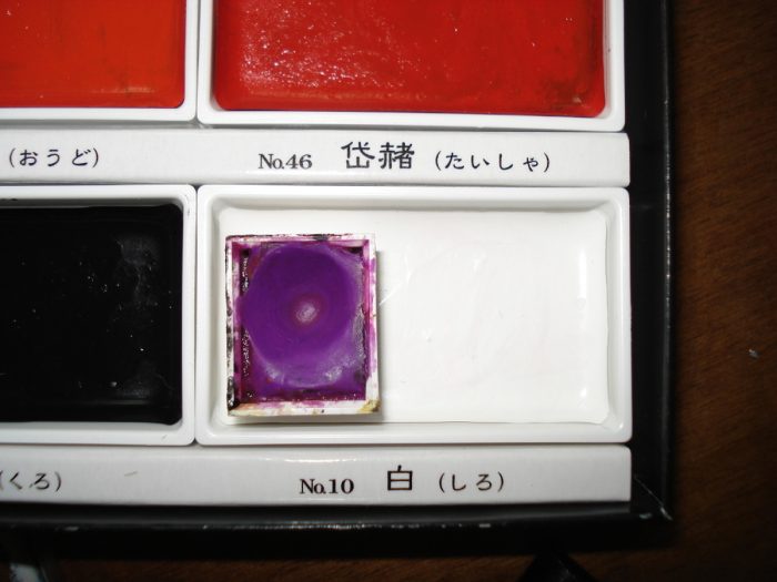
“The colours in the pans don’t have names neither indicate what sort of colour is supposed each of them to be, but are indicated by numbers.”
Actually.. the names are on the box and dividers next to their numbers as well as the underside of their pan!
Example:
しろ – Shiro – white
くろ – Kuro – black
They’re in Japanese and considering these are Japanese watercolors that’s to be expected~
I have a 36 set of Kuretake Gansai and I have no mixing issues. I actually get some of my favorite skin tones from this set compared to my w&n cottmans or my grumbacher academy’s!
I’ve just received a set of 12 from a friend for my birthday..I always use mainly winsor and newton ..so I am glad that I have read a few reviews from different people…it has let me know what to expect..rather than thinking that they are going to be the same as I already have..thankyou all..
Thank you all so much. I find these reviews really helpful from an artist’s perspective. I have been considering the purchase of one of the larger sets of these watercolors and you have confirmed that this will be a good purchase for my needs, as I rarely mix more than two colors at a time. Much appreciated!